CSS Basic Tutorial

What is CSS?

CSS(Cascading Style Sheet)是用于控制页面样式与布局并允许样式信息与网页内容相分离的一种标记性语言。如果HTML是人,那么CSS就是我们身上的衣服和化妆品!

CSS由选择器属性属性值组成:

1
selector{prosperties:value;}
  • 选择器:用于定义CSS样式名称
  • 属性:例如网页中的字体样式、字体颜色等
  • 属性值:例如字体的大小、颜色等
  • 属性和属性值必须写在{}内,且用“:”隔开
  • 每写完一个完整的属性和属性值,必须用“;”隔开
  • 如果一个属性有多个属性值,每个属性值用space隔开

引入CSS

1.内联引入

每个HTML元素都拥有一个<style>属性,我们的CSS代码都是作为HTML中<style>属性的属性值出现的:

1
<p style="color: red;">这是段落</p>

这是段落

2.内部引入

当我们页面有很多元素时,这样内联引入CSS样式代码显然是不合适的,比如当同一个元素需要复用同一种样式,我们需要在每一个元素内部手动添加,这样产生很多重复性的操作和劳动。所以我们可以将有相同需求的元素整理好分成许多类别,让相同类别元素使用同一种样式。

我们使用<style>标签进行对CSS的引入,在页面的<head>区域引入<style>标签,在其中写入需要的CSS样式:

1
2
3
4
5
6
7
8
9
10
11
12
13
14
15
16
17
18
19
20
21
22
<!DOCTYPE html>
<html lang="en">
<head>
<meta charset="UTF-8">
<meta name="viewport" content="width=device-width, initial-scale=1.0">
<title>Document</title>
<style>
p{
color:red;
font-size:20px;
}
span{
color:green;
font-size:10px;
}
</style>
</head>
<body>
<p> It's been a long day without you, my friend.</p>
<span>And I'll tell you all about it when I see you again.</span>
</body>
</html>

3.外部引入

在我们实际开发过程中,项目的页面不会少,如果我们希望所有的页面都使用同一个CSS样式,那么我们就需要将CSS样式单独放在一个文件中(新建一个以.css为后缀名的样式表)然后通过<link>标签引入到我们的页面中,这是你还会发现,当我们需要对所有页面进行样式修改时,就只需要修改一个CSS文件,不用对所有页面逐个修改!

CSS选择器

1.元素选择器

对HTML元素进行选取,如<p><ul>

1
2
3
4
5
6
7
8
9
10
11
12
<sytle>
p{
color:red;
font-size:20px;
}
ul{
list-style-type:none;
}
a{
text-decoration:none;
}
</style>

2.类选择器

通过class属性确定类名进行选取,相同类名的元素含有相同的CSS样式

1
2
3
4
5
6
7
8
9
10
11
<body>
<p class="title">我是一个段落</p>
<div class="container">这是一个容器</div>
</body>
<sytle type="text/css">
.title{
color:red;
font-size:20px;
text-align:center;
}
</sytle>
  • 类选择器前需要加.
  • vscode中,属性名+.+类名Tab自动补全<元素 class=“类名”>的形式

3.ID选择器

以上两种都是对同一类元素进行选取和操作,当我们需要单独为一个元素进行操作时,通过id属性确定ID名进行选取,如<p id="title"><ul id="list">,相同ID名的含有相同的CSS样式

1
2
3
4
5
6
7
8
9
10
11
12
13
14
<body>
<p id="title">我是一个段落</p>
<div id="container">这是一个容器</div>
</body>
<sytle type="text/css">
#title{
color:red;
font-size:20px;
text-align:center;
}
#container{
background-color:yellow;
}
</sytle>
  • ID选择器前需要加#

网页常用样式

字体

font-family字体

font-size字号

  • 像素(px)
  • 点数(pt)
  • 英寸(in)、厘米(cm)、毫米(mm)
  • 倍数(em)
  • 百分比(%)

font-weight字重

  • 正常(normal):400
  • 加粗(bold):700
  • 更粗(bolder)
  • 更细(lighter)
  • 数字(100~900):只能写成整百的数字

color颜色

相关内容前文有相应介绍,不再赘述

  • color_name
  • hex_number
  • rgb_number
  • rgba_number

text-decoration文本修饰

  • none:无修饰
  • underline:下划线
  • overline:上划线
  • line-through:中划线
  • blink:闪烁

段落

letter-spacing字间距

  • normal:正常
  • length:长度

word-spacing词间距

  • normal:正常
  • length:长度

text-indent缩进

  • length:长度
  • %:百分比

text-align水平对齐

  • left:左对齐
  • right:右对齐
  • center:居中对齐
  • justify:两端对齐

vertical-align垂直对齐

  • top:顶部对齐
  • middle:垂直居中对齐
  • bottom:底部对齐

line-height行间距

  • normal:正常
  • number:与当前字体尺寸相乘来设置行间距
  • length:固定行间距

边框

border-style边框线型

  • none:无边框
  • hidden:隐藏边框
  • dotted:点状边框
  • dashed:虚线边框
  • solid:实线边框
  • double:双线边框
1
border-style:dotted solid double dashed;
1
2
3
4
上边框是点状
右边框是实线
下边框是双线
左边框是虚线

1
border-style:dotted solid double;
1
2
3
上边框是点状
右边框和左边框是实线
下边框是双线

1
border-style:dotted solid;
1
2
上边框和下边框是点状
右边框和左边框是实线

1
border-style:dotted;
1
四个边框均为点状

border-color边框颜色

border-width边框宽度

盒子模型

盒子模型图解

  根据上图,俯视这个盒子,内边距(padding)可以理解为盒子里装的东西和边框的距离;而边框(border)就是盒子本身;内容(content)就是盒子中装的东西;外边距就是边框外面自动留出的一段空白;而填充(padding)就是怕盒子里装的东西损坏而添加的泡沫或者其他抗震材料;至于边界(margin)则说明盒子摆放时不能全部堆在一起,要留有一定空隙保持通风,同时方便取出!

外边距设置

使用margin属性设置外边距margin边界环绕在该元素的content区域四周,如果margin为0,则margin边界与border边界重合。

属性 描述
margin-top 上外边距
margin-right 右外边距
margin-bottom 下外边距
margin-left 左外边距

margin属性值仍然有四个参数,对应上、右、下、左即顺时针方向旋转

margin效果图

1
2
3
4
5
6
7
8
9
10
11
12
13
14
15
16
17
18
19
20
21
22
23
24
25
26
27
28
 <!DOCTYPE html>
<html lang="en">
<head>
<meta charset="UTF-8">
<meta name="viewport" content="width=device-width, initial-scale=1.0">
<title>Document</title>
<style>
div{
width:200px;
height:100px;
border:2px green solid;
background-color:crimson
}
.d2{
margin-top: 20px;
margin-right:auto;
margin-bottom: 40px;
margin-left:10px;
// margin:20px auto 40px 10px;
}
</style>
</head>
<body>
<div class="d1"></div>
<div class="d2"></div>
<div class="d3"></div>
</body>
</html>

当两个垂直外边距相遇时,他们将会形成一个外边距,合并后的外边距的高度等于两个外边距的最大高度(注意不是外边距相加)

margin外边距合并

内边距设置

使用padding属性设置内边距,内边距在边框和内容区之间,padding属性接受长度值和百分比,但不允许使用负值。

属性 描述
padding-top 上内边距
padding-right 右内边距
padding-bottom 下内边距
padding-left 左内边距

弹性盒子

默认流式布局中,块级元素(如div)会独占一行,多个div会垂直堆叠,无法横向排列;而当我们使用floatinline-box进行横向排列时,会带来间距、对齐、父元素高度塌陷等问题。

  当一种页面需要适应不同的屏幕大小以及设备类型时,弹性盒子可以确保元素拥有恰当行为的布局方式,这样的布局模型能提供一种更有效的方式来对一个容器中的子元素进行排列、对齐、分配空白空间

  • 只要给容器设置display: flex;任何一个容器我们都可以设置为弹性盒子
  • 设为flex布局以后,子元素的floatclearvertical-align属性将失效
  • flex-direction:设置排列方向(沿纵轴还是横轴)(正序还是倒序)
描述 动画演示
row 默认值,水平显示,起点在左端 1️⃣2️⃣3️⃣4️⃣_ _ _ _
row-reverse 盒子方向相反,且起点在右端 _ _ _ _4️⃣3️⃣2️⃣1️⃣
column 垂直显示,起点在上端
column-reverse 盒子方向相反,且起点在下端
  • justify-content:在主轴(横轴)上的对齐方式
描述 动画演示
flex-start 起点在左端 1️⃣2️⃣3️⃣4️⃣_ _ _ _
flex-end 终点在右端 _ _ _ _1️⃣2️⃣3️⃣4️⃣
center 居中对齐 _ _1️⃣2️⃣3️⃣4️⃣ _ _
space-between 项目之间的间隔相等,紧贴左右两端 1️⃣ _ 2️⃣ _ 3️⃣ _ 4️⃣
space-around 每个项目两侧的间隔相等 _ 1️⃣ _ 2️⃣ _ 3️⃣ _ 4️⃣ _
space-evenly 项目之间的间隔相等,且项目两侧的间隔相等 _ 1️⃣ _ 2️⃣ _ 3️⃣ _ 4️⃣ _
  • align-items:在侧轴(纵轴)上的对齐方式
描述
flex-start 起点在上端
flex-end 终点在下端
center 居中对齐
baseline 基线对齐
stretch auto尽可能接近所在行的尺寸
  • flex-wrap:弹性盒子的换行方式
描述
nowrap 默认值,不换行,盒子会被压缩
wrap 换行,第一行在上方
wrap-reverse 反向换行,第一行在下方
  • align-content多行情况下侧轴(纵轴)的对齐方式
描述
stretch 默认值auto,将占满整个容器的高度
flex-start 起点在上端
flex-end 起点在下端
center 上下居中对齐
space-between 项目之间的间隔相等
space-around 每个项目两侧的间隔相等

该属性只在多行(flex-wrap: wrapflex-wrap: wrap-reverse)的情况下生效!

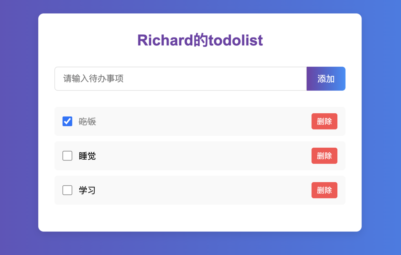
下面是使用CSS和HTML创建的“待办事项”demo!

“待办事项”样例展示

1
2
3
4
5
6
7
8
9
10
11
12
13
14
15
16
17
18
19
20
21
22
23
24
25
26
27
28
29
30
31
32
33
34
35
36
37
38
39
40
41
42
43
44
45
46
47
48
49
50
51
52
53
54
55
56
57
58
59
60
61
62
63
64
65
66
67
68
69
70
71
72
73
74
75
76
77
78
79
80
81
82
83
84
85
86
87
88
89
90
91
92
93
94
95
96
97
98
99
100
101
102
103
104
105
106
107
108
109
110
111
112
113
114
115
116
117
118
119
120
121
122
123
124
125
126
127
128
129
130
131
132
133
134
135
136
137
138
139
140
141
142
143
144
145
<!DOCTYPE html>
<html lang="en">
<head>
<meta charset="UTF-8">
<meta name="viewport" content="width=device-width, initial-scale=1.0">
<title>hello</title>
</head>

<body>
<div class="todolist">
<div class="title">
Richard的todolist
</div>
<div class="todo-form">
<input class="todo-input" type="text" placeholder="请输入待办事项">
<div class="todo-button">添加</div>
</div>

<div class="item completed">
<div>
<input type="checkbox">
<span class="name">吃饭</span>
</div>

<div class="del">删除</div>
</div>
<div class="item">
<div>
<input type="checkbox">
<span class="name">睡觉</span>
</div>

<div class="del">删除</div>
</div>
<div class="item">
<div>
<input type="checkbox">
<span class="name">学习</span>
</div>

<div class="del">删除</div>
</div>
</div>

<style>
.completed{
text-decoration: line-through;
opacity: 0.4;
}
.del{
color: red;
}
.item{
display: flex;
align-items: center; /* 垂直居中对齐 */
box-sizing: border-box;
width: 80%;
height: 50px;
margin: 8px auto;
padding: 16px;
border-radius: 0 20px 20px 0;
box-shadow: 0 2px 5px rgba(0,0,0,0.1); /* 修复阴影语法 */
background-color: #f9f9f9;
}

.todo-form{
display: flex;
width: 80%;
margin: 20px auto; /* 居中表单 */
height: 50px; /* 固定表单高度 */
}

.todo-input{
padding-left: 15px;
border: 1px solid #dfe1e5;
outline: none;
width: calc(100% - 100px); /* 自动计算宽度 */
height: 100%; /* 与按钮同高 */
border-radius: 20px 0 0 20px; /* 修复语法错误 */
box-sizing: border-box; /* 确保padding不增加总宽度 */
font-size: 16px;
}

.todo-button{
width: 100px;
height: 100%; /* 与输入框同高 */
border-radius: 0 20px 20px 0;
text-align: center;
background: linear-gradient(
to right,
rgb(113,65,168),
rgba(44, 144, 251,1)
);
color: white;
padding: 0 10px; /* 垂直居中文字 */
line-height: 50px; /* 与高度一致实现垂直居中 */
cursor: pointer;
user-select: none;
}

body{
background: linear-gradient(
to right,
rgb(113,65,168),
rgba(44, 144, 251,1)
);
margin: 0;
padding: 20px;
}

.todolist{
max-width: 600px; /* 限制最大宽度 */
width: 100%;
padding: 20px;
background-color: white;
border-radius: 10px;
margin: 40px auto; /* 水平居中 */
box-shadow: 0 5px 15px rgba(0,0,0,0.1);
}

.title{
text-align: center;
font-size: 30px;
font-weight: 700;
color: rgb(113,65,168);
margin-top: 20px;
margin-bottom: 30px;
}

.del {
margin-left: auto;
color: #ff4444;
cursor: pointer;
padding: 5px 10px;
border-radius: 12px;
background-color: #fef0f0;
}

.name {
margin-left: 10px;
flex: 1;
}
</style>
</body>
</html>

封面来源:Learn CSS Flexbox in 20 Minutes (Course)


CSS Basic Tutorial
http://example.com/2025/08/18/Full-Stack/CSS/
Author
Li Qinxuan
Posted on
August 18, 2025
Updated on
August 21, 2025
Licensed under